
CMYK and Pantone are two different ways of reproducing color on packaging. Choosing the right one affects print quality, color consistency and cost.
How CMYK works
CMYK mixes four inks – cyan, magenta, yellow and black – in tiny dot patterns to simulate a wide color range. It is the standard for photographic and full-color artwork. Every image in your catalog, every gradient and every product photo is printed in CMYK.
How Pantone works
Pantone colors are pre-mixed, single inks from a standardized library. Instead of being simulated with dots, a Pantone ink is mixed to an exact formula and printed as a solid color. This is why a brand’s signature red or blue is specified as a Pantone number – the color is identical on every run, in every factory, anywhere in the world.
When to choose what
- Use CMYK for photography, full-color artwork and designs with many colors.
- Use Pantone for brand-critical logos and solid backgrounds that must match exactly across products and repeat orders.
- Use both for brand colors (Pantone) plus photography (CMYK) on the same box – the standard approach for brand packaging.
What this means for your files
Artwork must be prepared in the right color mode. Converting a Pantone file to CMYK changes the color, sometimes visibly. When you send artwork to a printer, state the Pantone numbers explicitly – the prepress team cannot guess them from a PDF.
Consistency across the line
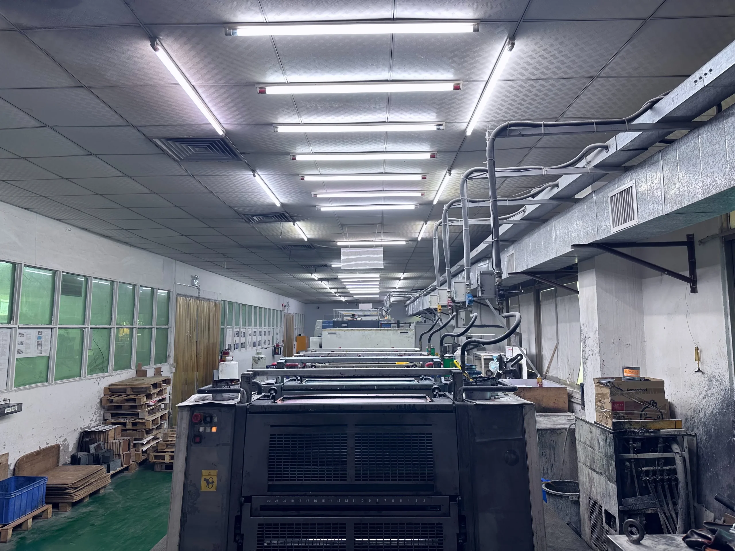
If your brand appears on gift boxes, food cartons and corrugated displays, Pantone ensures the logo color matches across every material. On uncoated kraft, Pantone colors print flatter than on coated paper – always proof on the real substrate. YMBOX runs 4-color offset plus Pantone spot colors on all press lines. Send your brand files and we will advise on the right color strategy.